
Have you opened your website on a phone and noticed that the text is too small, images are cut off, or the page needs horizontal scrolling?
These are common signs that your website is not mobile responsive.
A responsive website automatically adjusts to different screen sizes, including phones, tablets, and desktops.
Quick Tip: If your website looks fine on a computer but breaks on a phone, check its mobile layout and CSS first.
Why Is My Website Not Responsive on Mobile?
Here are some common reasons:
1. Missing Viewport Tag
The viewport tag helps your website fit the phone screen.
| Add this inside the <head> section: <meta name=”viewport” content=”width=device-width, initial-scale=1″> |
2. Fixed Widths
Using large fixed widths can make your website wider than the phone screen.
| Use flexible widths instead: .container { width: 100%; max-width: 1200px; } |
3. No Mobile CSS
Your website may need media queries to change the layout on smaller screens.
| @media (max-width: 768px) { .content { width: 100%; } } |
4. Large Images
Large images can overflow the screen.
| Use: img { max-width: 100%; height: auto; } |
5. Small Buttons
Buttons and links should be easy to tap on a phone. Give them enough size and space.
Simple Check: Open your website on your phone. Check the menu, text, images, buttons, and forms. Make sure nothing is cut off or difficult to use.
How to Test Your Website on Mobile?
You can test your website using Chrome:
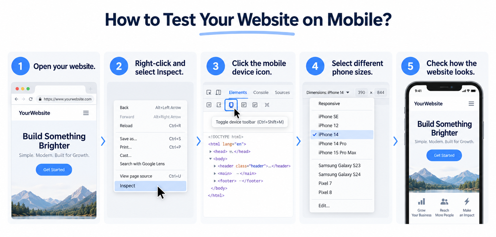
- Open your website.
- Right-click and select Inspect.
- Click the mobile device icon.
- Select different phone sizes.
- Check how the website looks.
If your website is responsive but still takes too long to load, checking its performance can help identify other issues. Our developer checklist for fixing a slow website covers common causes of slow loading and practical ways to improve website speed.
Quick Fixes
| Problem | Fix |
| Website is too wide | Use flexible widths |
| Images are cut off | Make images responsive |
| Text is too small | Use readable font sizes |
| Layout breaks | Add media queries |
| Buttons are hard to tap | Increase their size |
Make Your Website Mobile Friendly
If you are wondering Why Is My Website Not Responsive on Mobile, start by checking the viewport tag, fixed widths, images, and mobile CSS.
A responsive website gives visitors a better experience and makes your pages easier to use on any device.
If you are facing other website issues, explore our guide to Website Problems and Fixes for practical solutions to common website problems.
Frequently Asked Questions
Common reasons include fixed-width layouts, missing viewport tags, large images, and missing mobile CSS.
Open your website on a smartphone or use Chrome Developer Tools to test different mobile screen sizes.
Images with fixed dimensions can extend beyond the screen. Using max-width: 100% can help them fit within their container.